Google started replacing their Play logos over the last 2 weeks, and I have to say I’m not to crazy about them. The latest changes for Google Play is updating the branding to fit in with the Material Design style.
“I will miss the headphones for Play Music.”
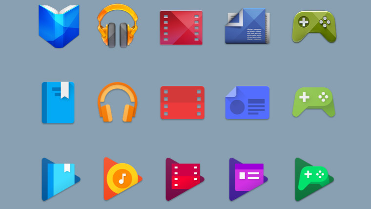
Maybe it’s just because I’m just so used to it but the new logos clash in color and are hard to make out. Here is the evolution of the logos – top is the old and bottom row is the latest.
Jonathan Chung, Visual Design Lead for Google Play said “Since launching Google Play four years ago, we’ve always had dedicated apps in addition to the Google Play store.”.
Chung continues: “Today, all our icons are getting an updated to provide a consistent look across the entire family of Play apps.”
“We hope you’ll continue enjoying the Play family of products – now with a new look,” he adds.
 The headphones that have been closely tied to the service since it launched in 2011 are gone, replaced by a simple music note inside of the service’s trademark orange color. While these new logos make it a little harder to see exactly which service is represented by each, the “play” badge in the background definitely ties the family of apps together. Google says you’ll start seeing these new icons across various apps and on the web “in the coming weeks.”