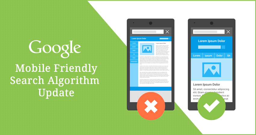
 If you still haven’t converted your site to responsive design, or don’t know what I’m even talking about, then you will LOSE customers! Making your website mobile friendly is a necessity, not a nice-to-have. Google changed their algorithm back in 2015 and if your site is not responsive it will fall to the end of search pages. I mean really far down.
Customers are used to smooth running, easy to navigate, mobile sites like Amazon, Target or Zappos.com. It’s what your customers want – and they expect you to provide a good mobile experience. With Wordpress responsive design templates there are no excuses for you to update your site.
Click here now to see if your site is mobile friendly.
Mobile websites are vital to purchasing decisions and habits of consumers. Google did some research and published the graphic below. Pretty amazing.

Google reported that,
“…in the USA, 94% of people with smartphones search for local information on their phones. Interestingly, 77% of mobile searches occur at home or at work, places where desktop computers are likely to be present.”
So, what should you do? Google offers up some information here. And below are some next steps and links that will help you.
What are the next steps?
- Check to see if your your current site is mobile friendly, if you haven’t already.
- If your site was made by selecting a template or theme from third-party website software, check out Customize Your Website Software for Mobile Users, which can be the fastest way to become mobile-friendly!
- If you’re going to hire a web developer, check out our guide for hiring someone
- If you want more information on the mobile website implementation process, check out our docs on Mobile SEO.
- If you’re ready to build a mobile-friendly site, choose responsive web design. View Google docs on Mobile SEO or go straight to Web Fundamentals and Principles of Site Design.
- If you’d like to learn more about making your business mobile-friendly, we recommend: The Mobile Playbook, Think with Google for the Mobile Platform, and Google’s Multi-Screen Success Stories.