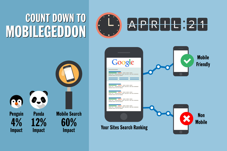
MOBILEGEDDON is almost here. Are you ready?
On April 21, Google is changing the algorithm for its mobile search, putting websites that are deemed “mobile friendly” higher in the mobile search rankings. It also means that websites that have had high rankings in search results could lose their prominent positions if they are not optimized for mobile devices. If you didn’t get the Google memo your website may be at the bottom of search this April. So, the good news is that mobile sites will rank higher. The bad news is that mobile sites will rank higher (than a non – friendly mobile site). It depends on which site you have. Do you even know?
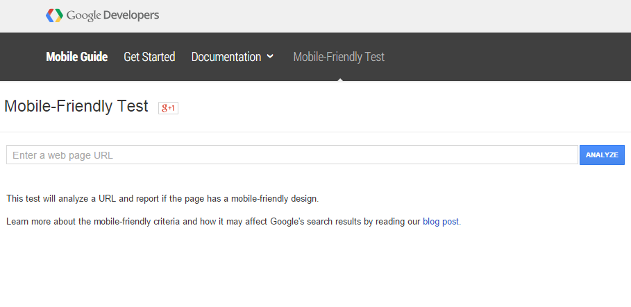
CHECK YOUR SITE NOW. Is it mobile friendly?
Enter your URL to see if your site is mobile friendly.
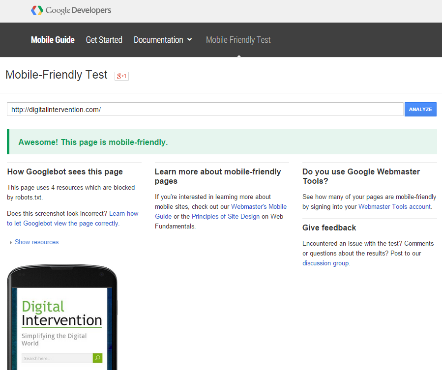
If your website passes the test, the screen will look like this.
“This change will affect mobile searches in all languages worldwide and will have a significant impact in our search results,” Google noted in a blog post.
“Consequently, users will find it easier to get relevant, high-quality search results that are optimized for their devices.” But, for companies that have put off updating their websites to make them mobile friendly, you will fall to the bottom of the pile.
According to Search Engine Land, the following are three recommendations to start assessing and optimizing your mobile web search presence. In doing so, you will provide the best experience to your mobile users:
- Identify & Improve Your Mobile Web Optimization Status
Even if you have a mobile-ready site, it’s important to dig deeper by doing a mobile SEO audit so Google can correctly identify and serve your mobile content. Start by validating your site with Google’s mobile friendly test tool, making sure the site resources such as images, CSS, JS are also crawlable. - Assess Your Mobile Web Search Visibility & Traffic Behavior
In Google Webmaster Tools, identify the top queries and top pages in mobile search with the “Mobile” filter of the Search Queries report.Are the top queries and pages in mobile search the same as those in desktop search, or are they different?
Are your mobile users searching for the same information in the same way as your desktop users?
Which queries have a high click-through rate (CTR) despite not being in the first positions? Which ones have a low CTR despite ranking well?
Which search queries and pages are trending upwards in traffic and rankings? Which are trending downwards?
Further your understanding of mobile search visibility and user behavior by analyzing your mobile traffic in Google Analytics with a mobile organic advanced segment. - Establish Your Mobile Web Search Competitiveness & Monitor Your Performance
Use tools like SEMrush, SearchMetrics, Sistrix or SimilarWeb to discover the keywords for which your mobile search competitors are ranking, and use this information to identify more potential keywords to target.Once you’ve compiled a list of keywords your competitors are ranking for, you can combine them with the keywords from your top mobile search queries report in Google Webmaster Tools to create a master list of keywords.Segment these keywords into categories and perform keyword research with the Google Keyword Planner. Aside from suggesting potential new keyword ideas, the Keyword Planner allows you to view “Mobile Trends” and see a “Breakdown by Device,” which will give you an idea of mobile search volume and trends over time. This data will allow you to prioritize the keywords with the highest potential.
See full article from SEL.
At the end of the day, this is all good. And to Google’s defense they have been talking and warning about this for years. Yes years. So bring it on – I’m ready.